Client
Sneak
Sneak
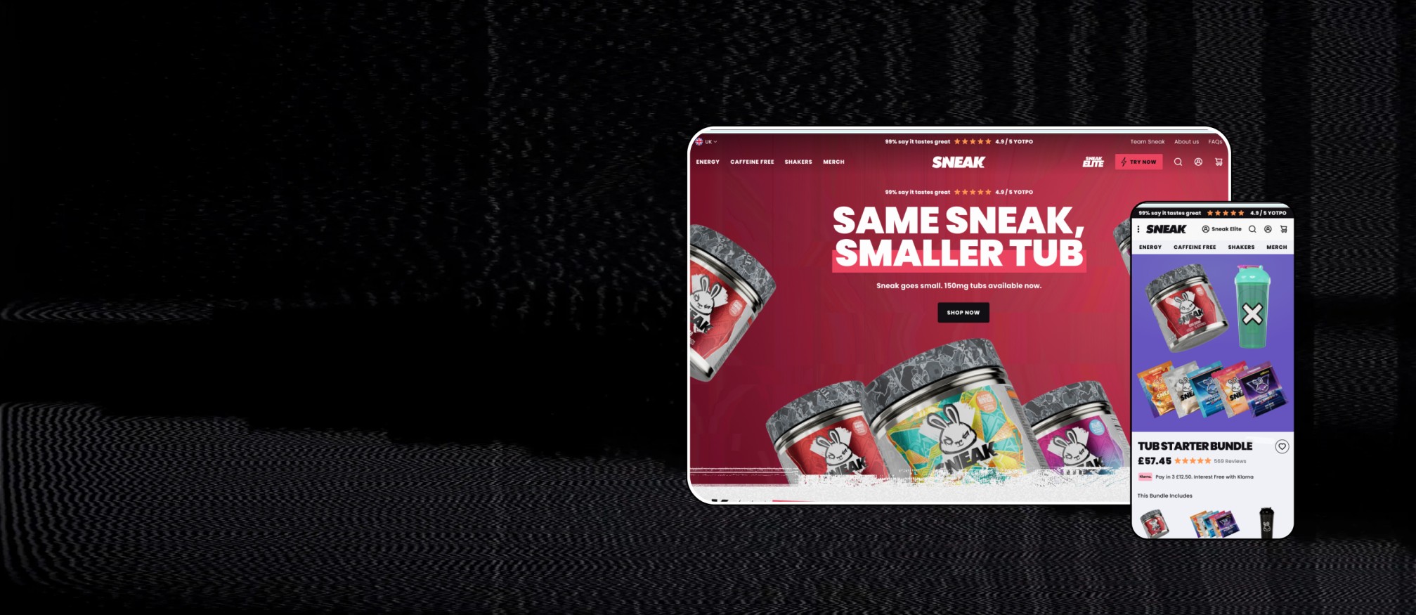
Sneak was looking for a full site redesign to improve UX and increase conversion rates, specifically for mobile users.
UX/UI Focused Website Redesign
Improved UX clarity, storefront performance, and conversion flow.
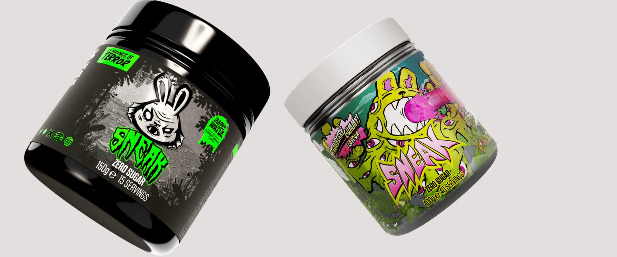
Sneak is a low-calorie, sugar-free energy formula, with caffeine, vitamins, minerals, amino acids and electrolytes. Available in powdered form or ready-to-drink cans, it offers a powerful, sustained energy boost.
Sneak was looking for a full site redesign to improve UX and increase conversion rates, specifically for mobile users.
The core goals for the project were:
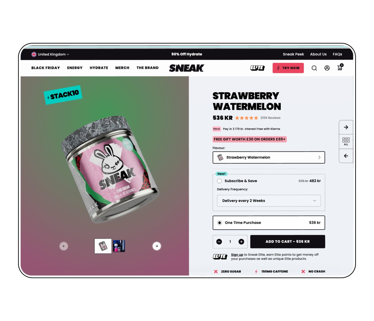
We were tasked with designing a Shopify site to showcase the brand and clearly communicate Sneak’s personality and USPs. We redesigned the site to make it easier for new and existing customers to understand everything Sneak offers, with a natural journey taking them through the purchase process.
Core design focuses included adding a sticky add-to-cart - an addition proven to increase conversions by allowing quick ATC no matter where the user is on the site - homepage, collection page, landing page, product page - you can purchase from anywhere. We also increased key information at the top of the page to explain the brand’s value proposition and entice users to continue scrolling, helping them make informed decisions on their purchases.
We made sure that the customer is engaged on every page, with access to the right information for whatever stage they’re at in the purchase journey. This was done through creative content, animation and intelligent use of graphic and video content.
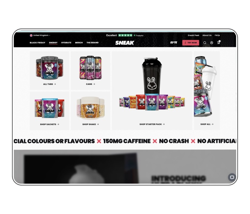
We focused on the overall look and feel to improve engagement and performance. A new bespoke bundle builder allows the user to curate seamless customisable bundles of their favourite flavours, and gives Sneak flexibility to introduce new mechanics in the future.
The new site was designed with speed in mind, relying less on the heavy imagery prevalent in the previous iteration which was impacting page load speed.
A big shout out to the guys at Fobkisco who did a fabulous job of making our vision come to life through the design!
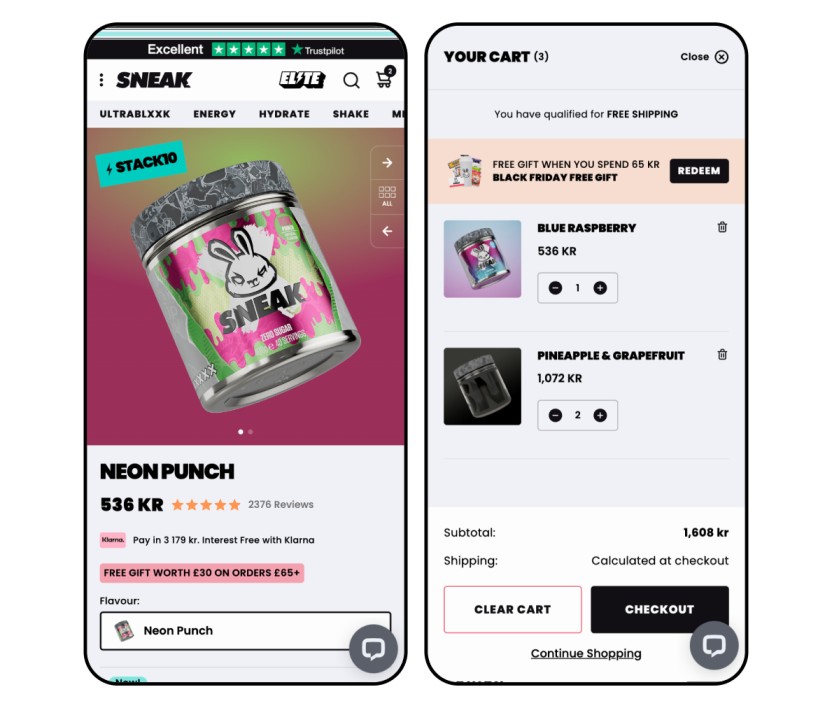
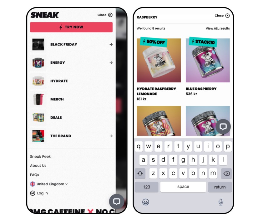
While not forgetting desktop or other sources of traffic, we focused the design of the new site on the fact that 80% of its traffic is mobile-based. The end result is a site designed to work superbly on mobile devices. The mobile first collection pages let customers view 4 products on their screen at once, reducing scroll length and drop-off.
The relaunched site has improved product search, discovery and navigation, as well as product recommendations. The addition of a mobile scroller navigation (as well as the traditional slide out) gives the site a native app feel and enables the user to navigate through the site in fewer clicks.
If your Shopify store is in need of a redesign, get in touch for a chat with our Business team. We can reimagine your site so it's not only modern and vibrant, but with an improved customer journey and UX to help you make more sales.